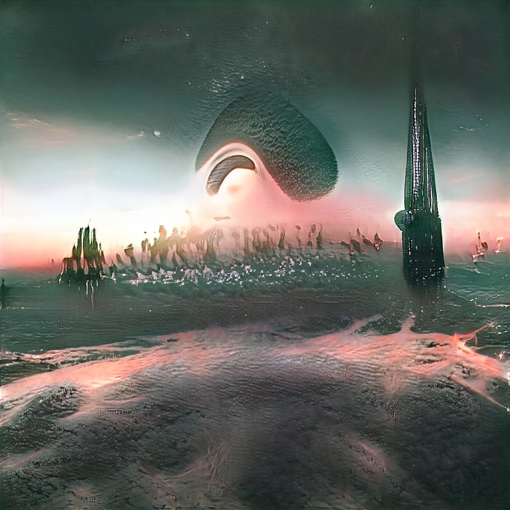
Armless Demon Slaying Mayhem
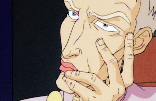
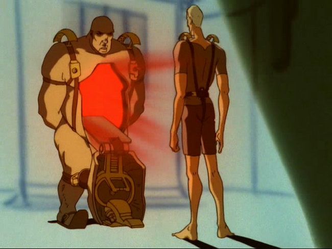
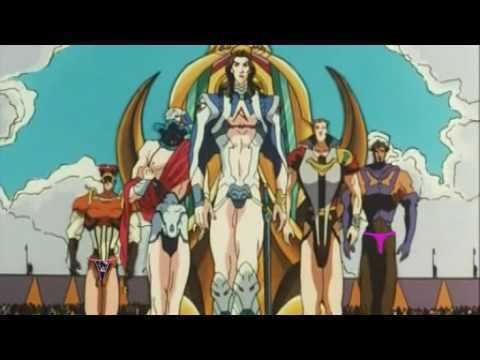
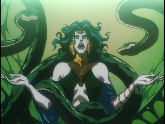
Asura’s Wrath was a 2012 console button smasher featuring a multi-armed (and at some points no armed) protagonist through a mythical sci-fi fantasy setting that draw heavily from Hindu and Buddhist inspiration.
Studio 4ºC creators of such epic productions as Memories, Spriggan, Tekkonkinkreet, Justice League: The Flashpoint Paradox and the insanely fun Mutafukaz produced beautifully animated 2D cut-scenes for the game.
The style is a beautiful combination of movement, chaos and visual overload. Videos sourced from the amazing Catsuka website.
Enjoy the chaos, it’s definitely tweaking all of my animation inspiration!
A Little Animated 2000ad Goodness
Thought for the Day…
As I was falling asleep, the thought came to mind: ‘I saw the greatest minds of my generation destroyed by Facebook.’
Augustin Fernandez Mallo
Rhapsody in Solitude
Arzach, the creation of French comic auteur Jean ‘Moebius’ Giraud was always such a surreal and enticing visual feast for me. Expansive yet extremely minimal, simple yet richly complex, the juxtaposition of such polar opposites is held together by the breathtaking draftsmanship of the artist, this is truly an example of ‘show, don’t tell’.
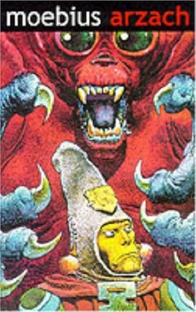 The titular character
Essentially, a lone traveller flies across strange, desolate lands on his truaty Pterodactyl! Jiraud said he wanted to explore the idea of solitude in a positive lens. As the artist himself was know for craving it.

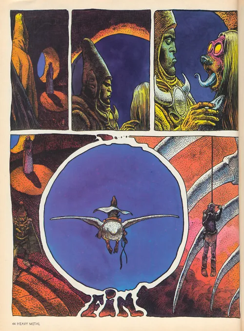
In 2003 a short animated series was produced, it’s pretty raw, introduces extra characters but none the less is still pretty cool to watch. Here’s the collected 14 episodes.
Blue Monday?
Blowing away the Monday afternoon drag with the Blue Man Group with Venus Hum
An Artificial Clockwork Reimagining
 I’ve always had a strange fascination with Anthony Burgess’ dystopian satire A Clockwork Orange and the adaptation by Stanley Kubrick.
The imagery from the later is deeply ingrained in the psyche of western pop culture, and the film holds an interesting place in cinematic history. Partly due to the unflinching depictions of sexual violence and the response of the general public that resulted in Kubrick himself pulling the movie from cinemas at the time.
Nothing like getting censored or banned to jet propel you to cult status!
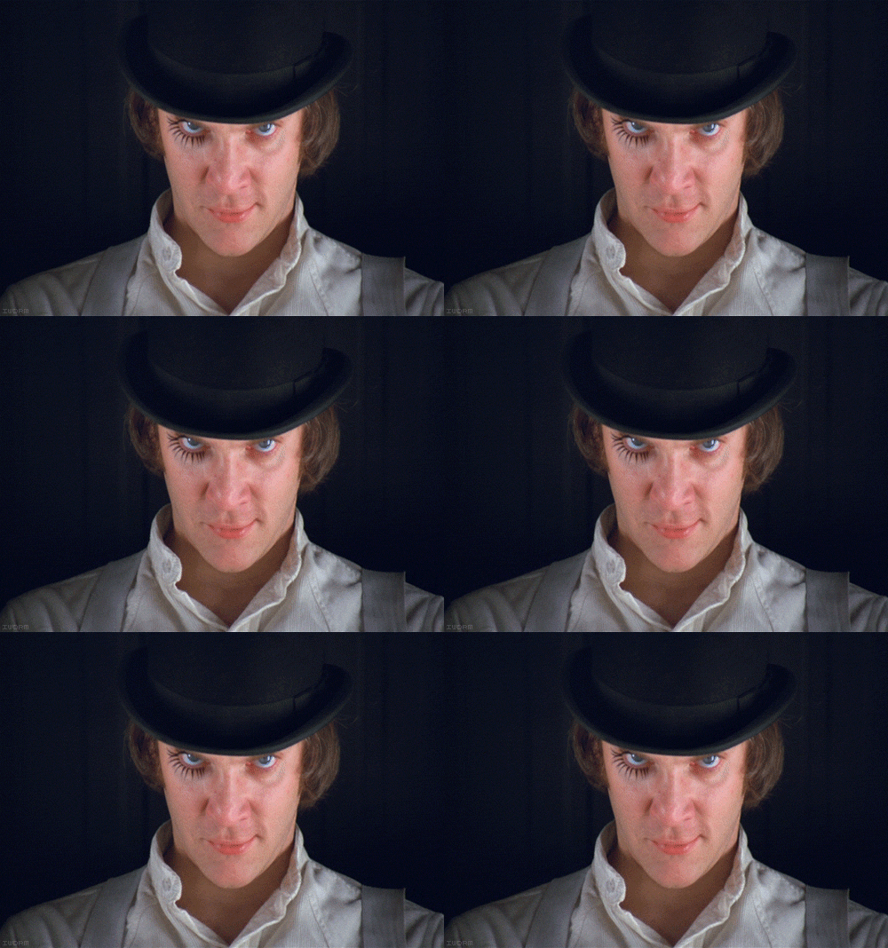
My contact with A Clockwork Orange was at a very early age, the iconic image of Malcolm McDowell as Alex DeLarge as a full colour, full page image in a book on Science Fiction cinema.
 Malcolm McDowell as Alex DeLarge
I was kind of blown away, after reading about the movie and subsequently looking for it on VHS, I found it was not available (this was the 80’s after all) and the only way to see it was at an indie cinema, that screened it weekly opposite David Lynch’s Eraserhead a movie as equally notorious as it is different to A Clockwork Orange. Being a 14 year old punk rock kid at the time, this just served as fuel for a fire in my imagination.
In response to this caged fascination, I sought out the novel. Now in the meantime I’d discovered the filmmaker Terry Gilliam and his epically dystopian Brazil with it’s exceedingly Formica Punk/Cassette Futurist look, dark storyline and nihilistic world building, it certainly left an impression.
While reading the Burgess novel I was primed to envision a world constructed from Gilliam’s vision. The book is an amazing dark satire of society, pushed to an extreme of violence, disconnection and government funded mind-control. Needless to say the movie in my head was gritty, grim and highly visualised.
Then along came the beautiful bleed of pop culture crossover. I began to find Halloween costumed girls dressed as highly sexualised Droogs, The Simpsons parody of the film, t-shirt designs and music videos borrowing imagery from the film thrust the Clockwork Orange pocket universe I’d constructed for the movie into a strange, vaulted pool of inspiration.
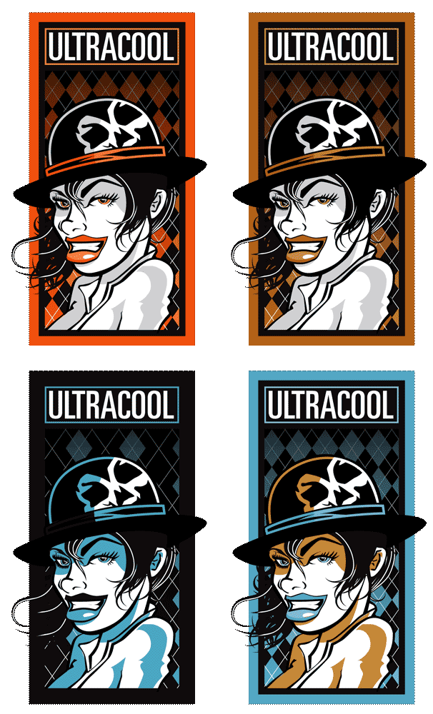
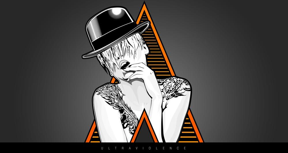
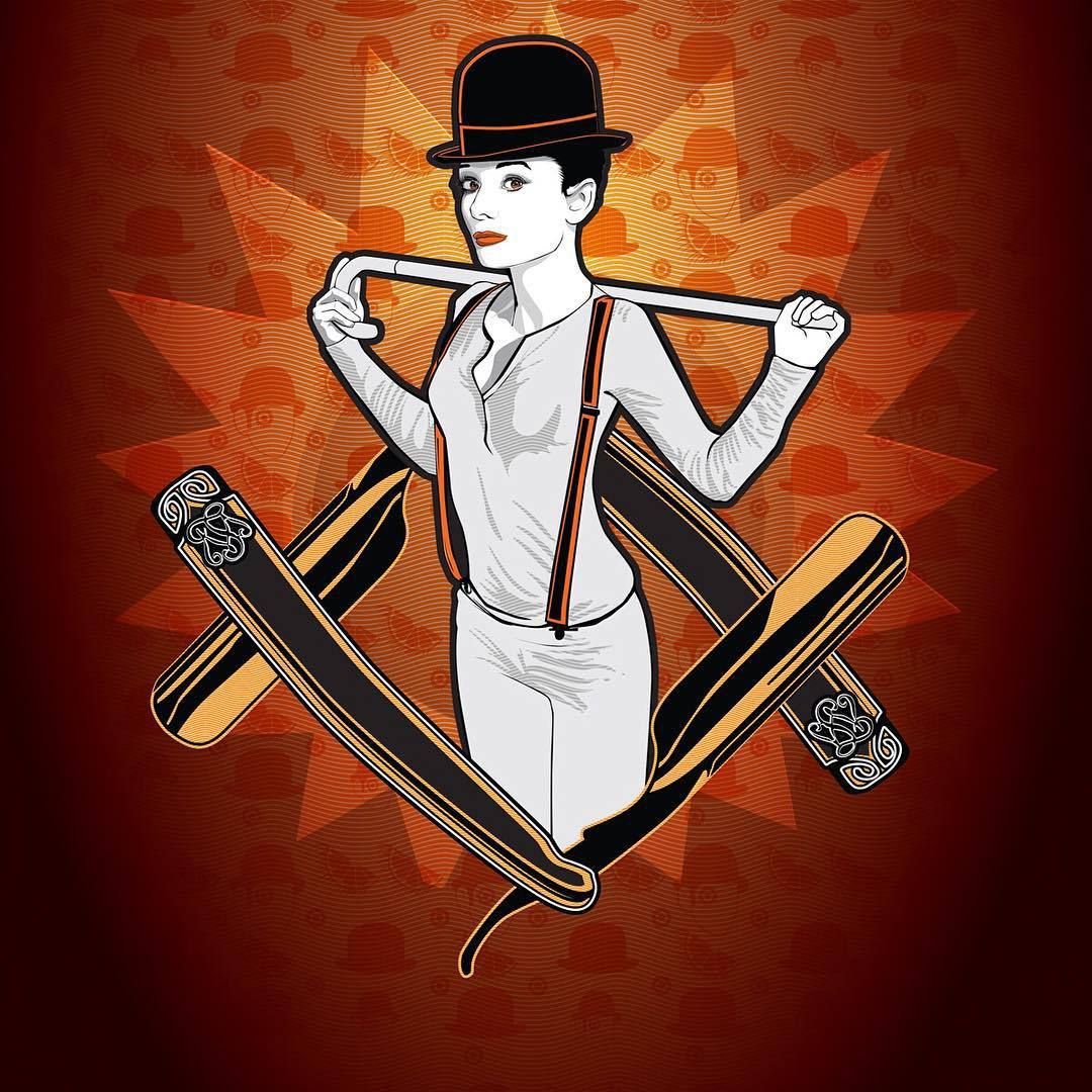
Leading me to create these pieces.
 A creative brand idea
  Illustration piece called Ultraviolence
  Breakfast at Kerova’s
Fast forward to a decade later and I finally got to see the movie digitally, and…
I was pretty disappointed.
After all the movie didn’t have the highest budget and couldn’t possibly reach the production level of my minds eye.
I am happy to say that I’ve matured in my appreciation for the film and visually, the Korova Milk Bar opening is stunning in it’s visual storytelling.
Open The Pod Bay Door Hal
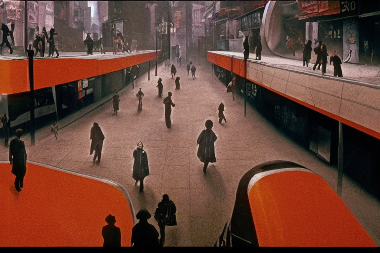
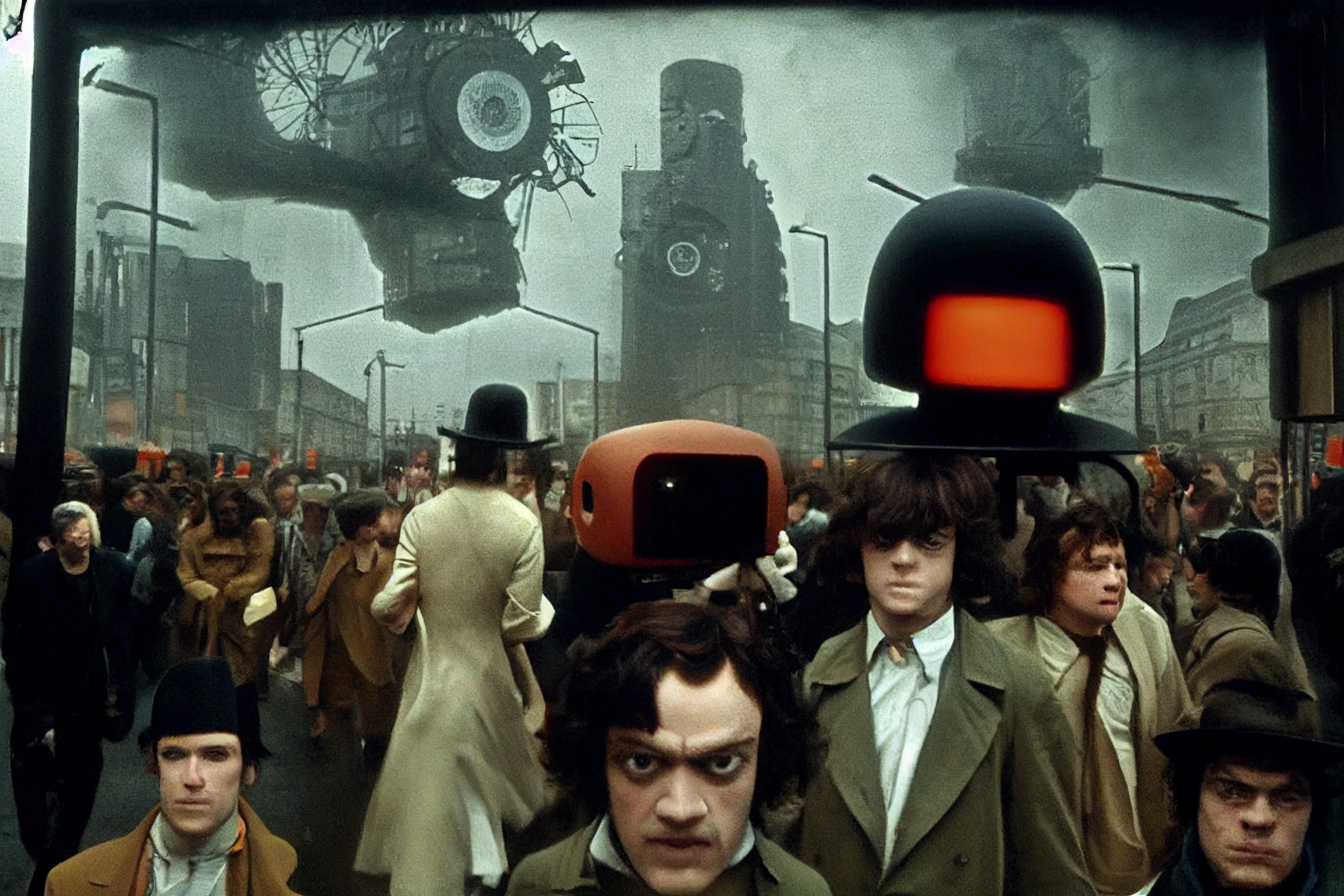
I’ve posted some of my AI art previously and I’ve become a regular user of the MidJourney platform. One of my recurrent personal challenges has been to effectively integrate the medium into my own work.
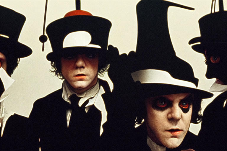
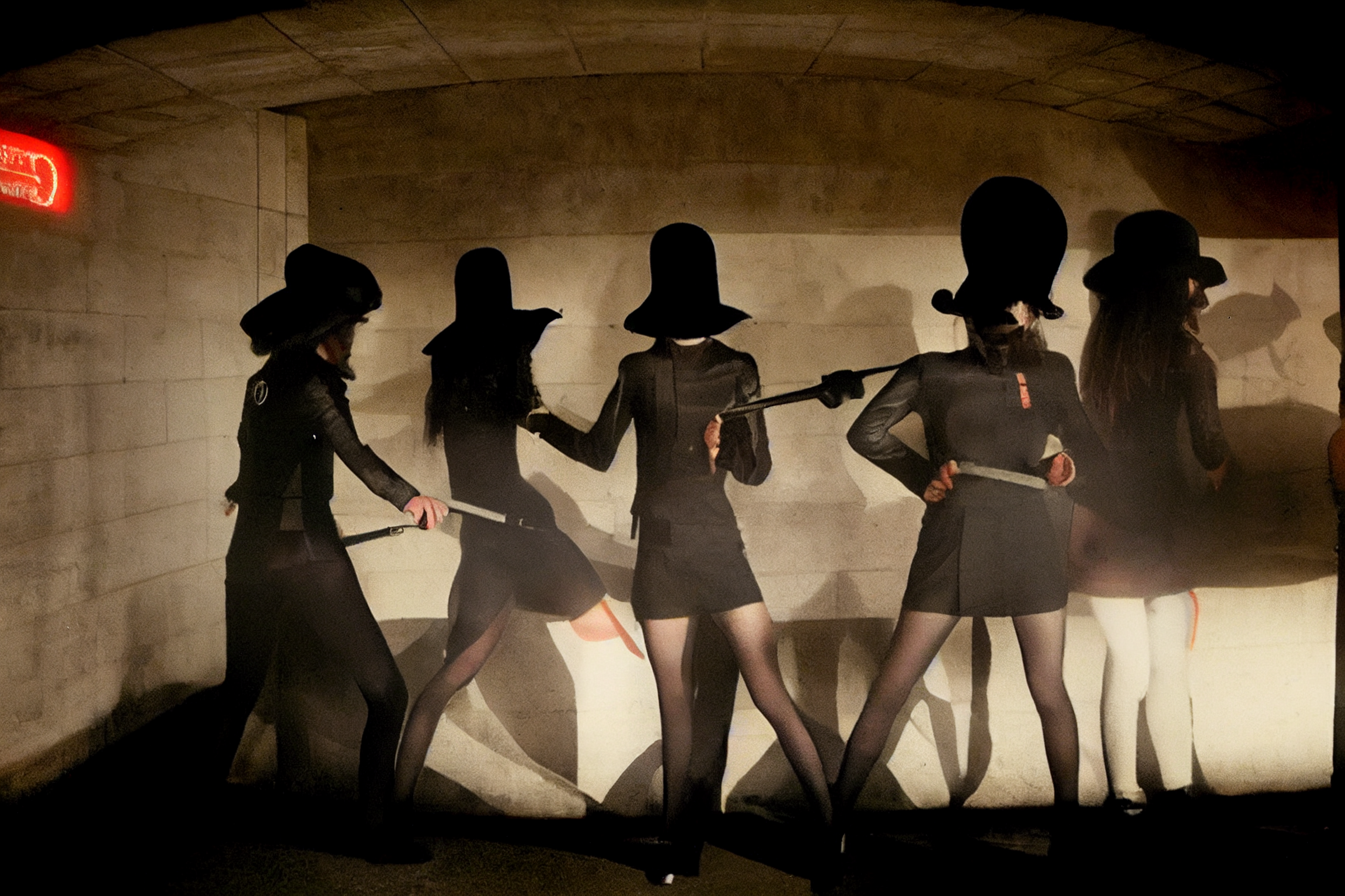
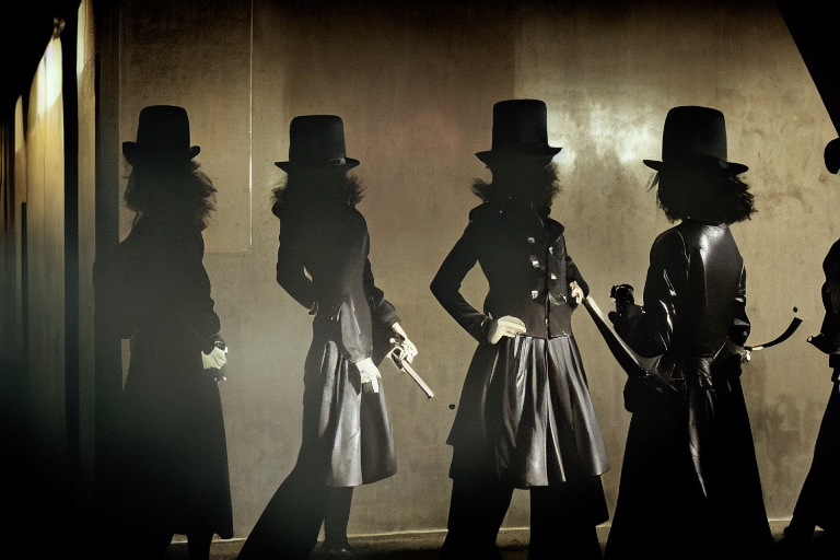
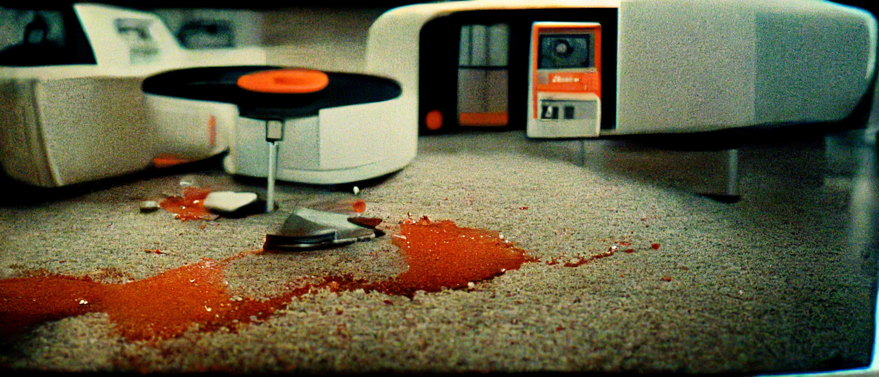
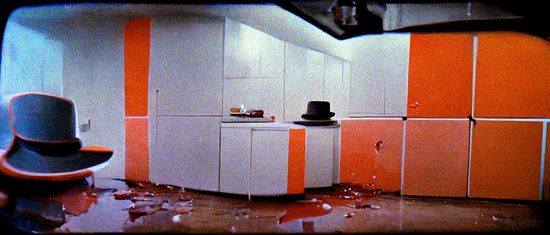
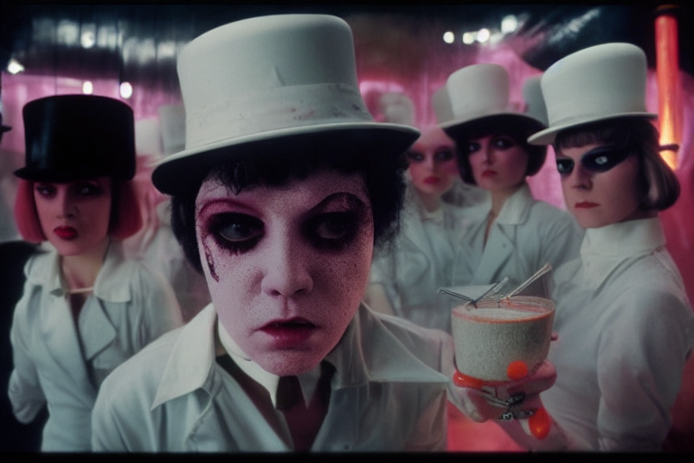
Enter my Terry Gilliam inspired remake of A Clockwork Orange.
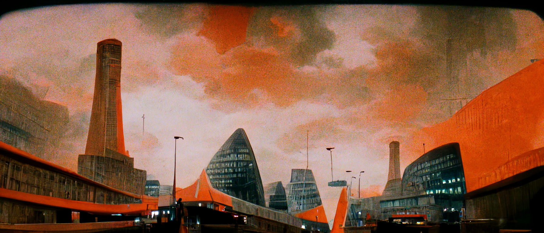
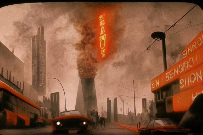
I began building out text prompts that set up scenes of Droogs in Cassette Futurist settings, leaning hard into 60’s design motifs.
 A really early attempt resulting in something that looks more like a Jack White album cover, cool but not what I wanted
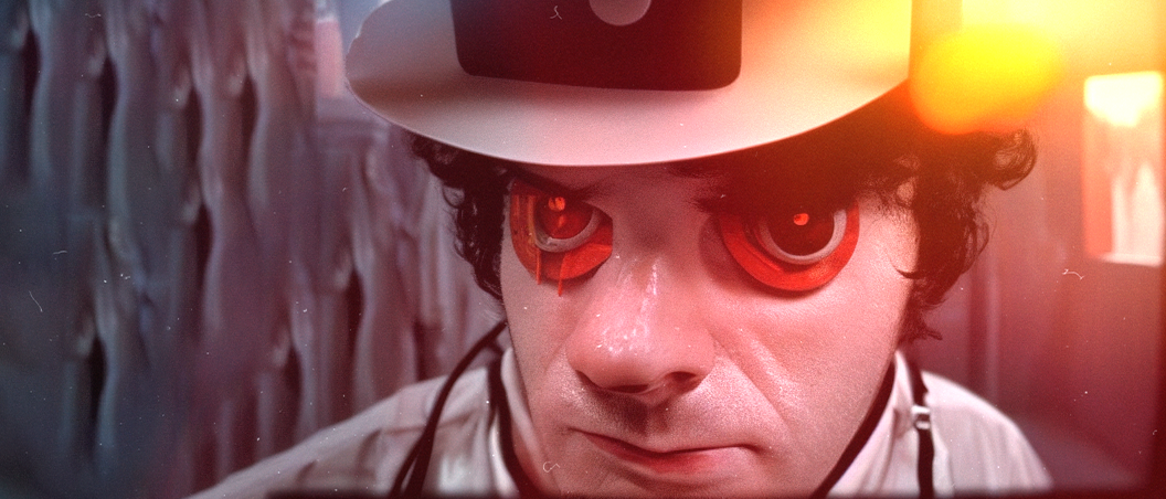
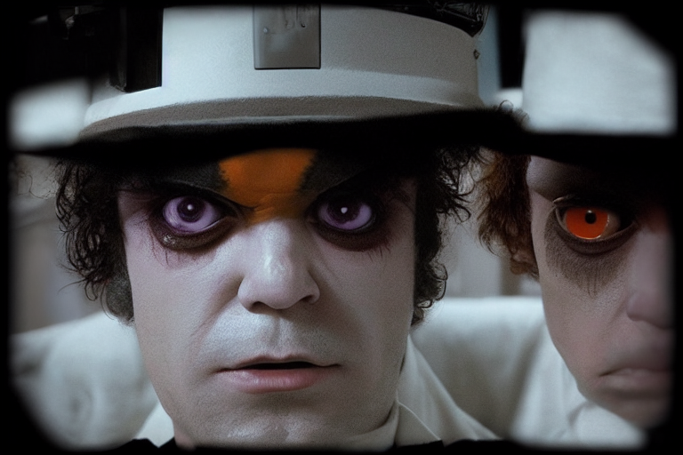
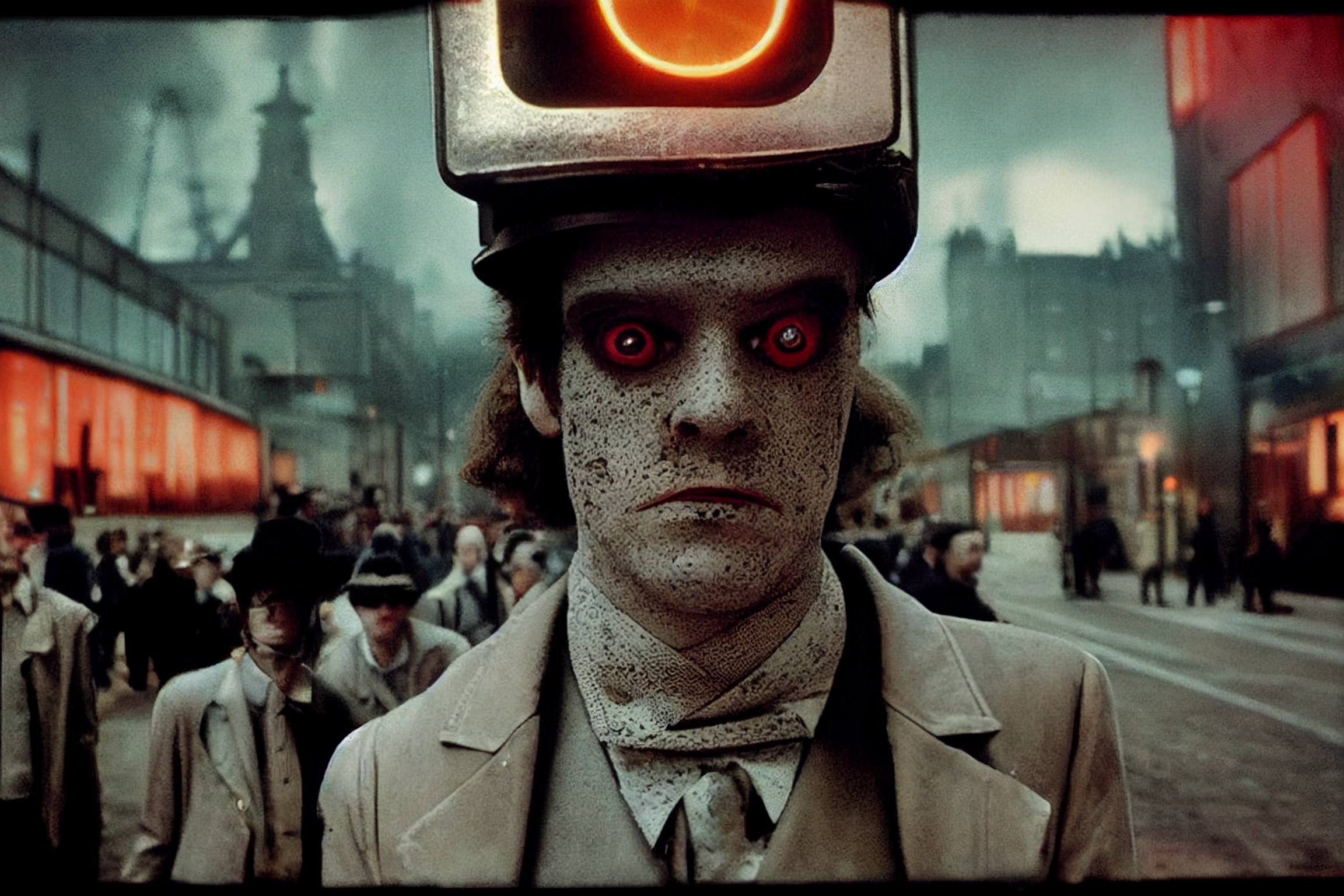
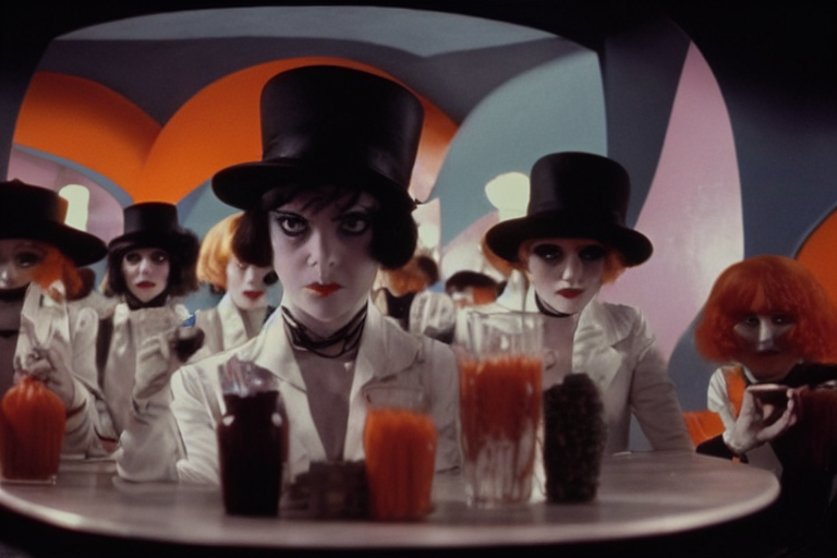
 After tweaking my prompts I managed to get some distinctly late 60s Droogs, I quite like the slight uncanny valley and distortion achieved with these.

 Its interesting to note how the AI got very literal with the term Orange, adding it as an accent colour or in some cases, drawing an image of a orange slice into the image
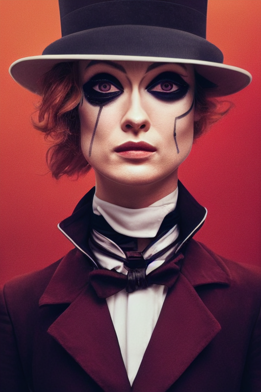
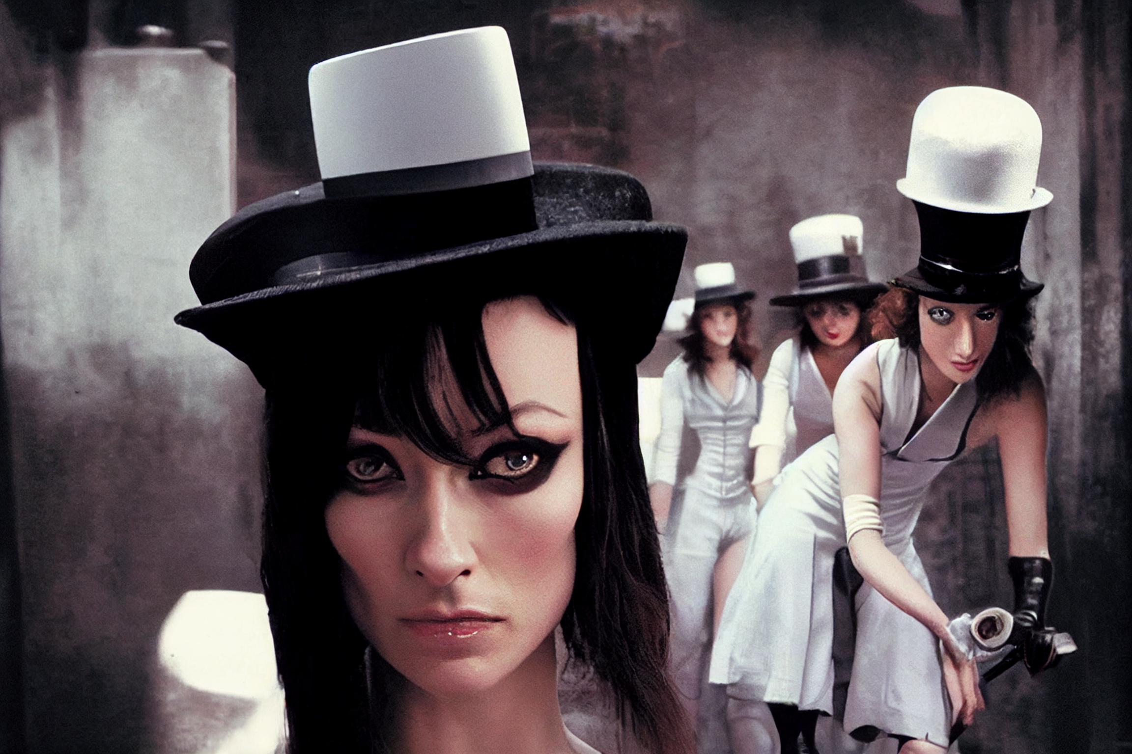
In keeping on trend, and perhaps pandering to my own vices, I switched the Droogs to female. For one, I thought it would be more interesting to feature sociopathic female dilettantism to potentially broaden the concept.

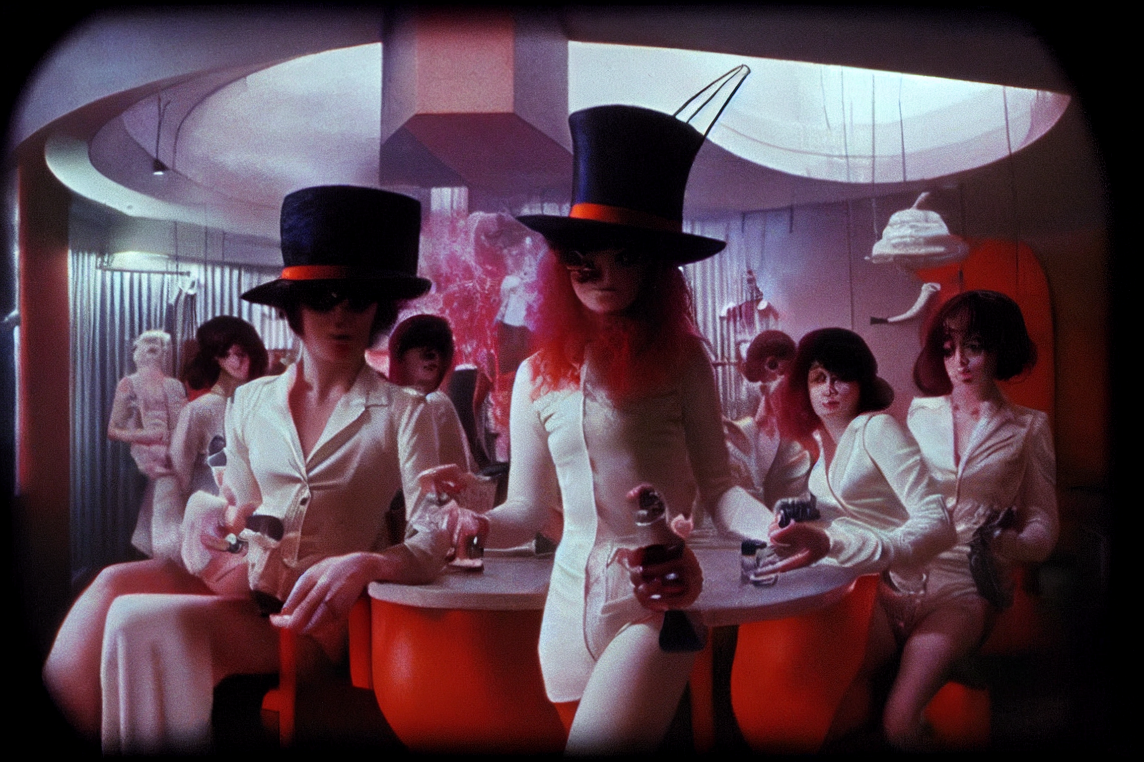
 My first passes at female Droogs were cool but a little too Christian Dior and not enough Viddy Well

 With a little prompt tweaking I managed to get a much more late 60’s vibe
The environment design was a lot easier to achieve, Cassette Futurism isn’t too hard to replicate. 


About a third of the way along in the process, I decided to cast Olivia Wilde as Alex. This yielded some cool results.


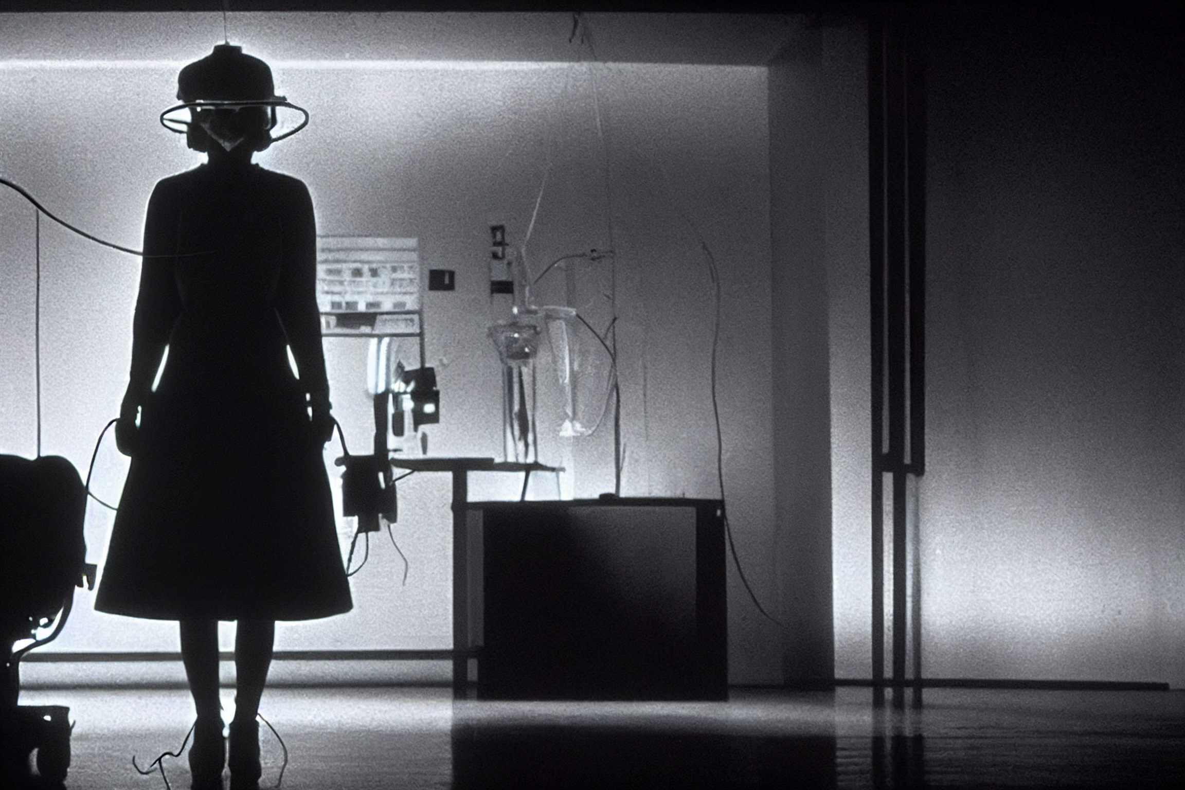
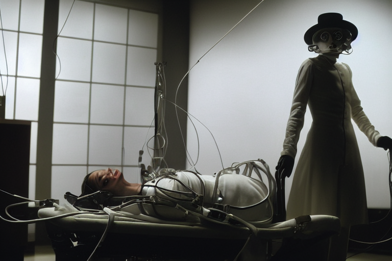
And for the mind control, government project aspect of the movie, I created some genuinely disturbing imagery, which was of course pretty awesome!


After creating a few hundred images, covering everything from characters, specific scenes and world building environments I was left with, well, a bunch of images. So I decided to kick it up a notch and animated a ‘Sizzle Reel’ as a proof of concept.
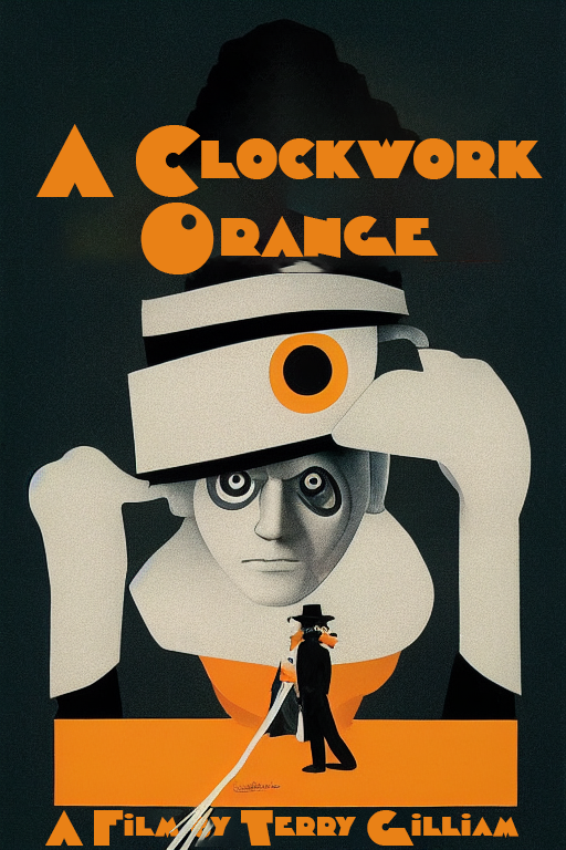
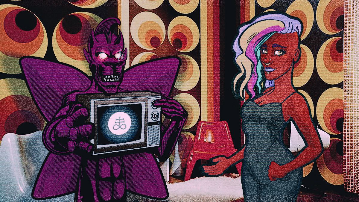
Finally I generated some pop-art style posters with MidJourney to round out the piece.

Overall it was a fun creative experiment, not necessarily a successful one but I certainly scratched a creative itch.
So will this be my last dalliance with the world of Alex DeLarge? Probably not, but it’ll keep me satisfied for a while.
The Clockwork Is Still Turning
It’s been several years and while doing some research to pull together my reel, I found there’s still a very healthy interest in the material. A stand out for me was Frank Kozik’s Ludwig Van bust, the Rob Zombie music video for ‘Never Gonna Stop’ and I even found a porn parody called ‘A Clockwork Whore’. Feel free to Google that one yourself, I’m not putting the trailer on here.
 Ludwig Van by Frank Kozik
  Detail of Ludwig Van
 Clockwork Porn…
Whether it’s the visual language created by Kubrick or the social commentary posed by Burgess, I would recommend checking out A Clockwork Orange, at the very least you might wind up with a Halloween costume idea, if not some rich creative inspiration.
REALITY IS THAT WHICH, WHEN YOU STOP BELIEVING IN IT, DOESN’T GO AWAY.
PHILLIP K. DICK
A Love Letter to the Art of the Mixtape
Random internet wanderings often yield somme of the best finds, such as this documentary by filmmaker Robert V. Galluzzo. Analogue Love is a nostalgic breakdown of the art, emotion and ideology of the mixtape. Something I was both present and active for throughout my teens. The impassioned recaps by Henry Rollins, Jennifer Finch (of L7), Jimmy Urine (Mindless Self Indulgence) and Chantal Claret (Morningwood and solo artist) all serve to perfectly present the graces and nuance of a singularly short lived method of cultural communication.
It also clearly shows the amount of labour required to create a mixtape and the fruit it can bear.
If you’re from the era and feeling nostalgic or into the energy of DIY, independent expression and creativity or a scholar of contemporary communication niches, I recommend this trip down memory lane.
Gothic Tendencies
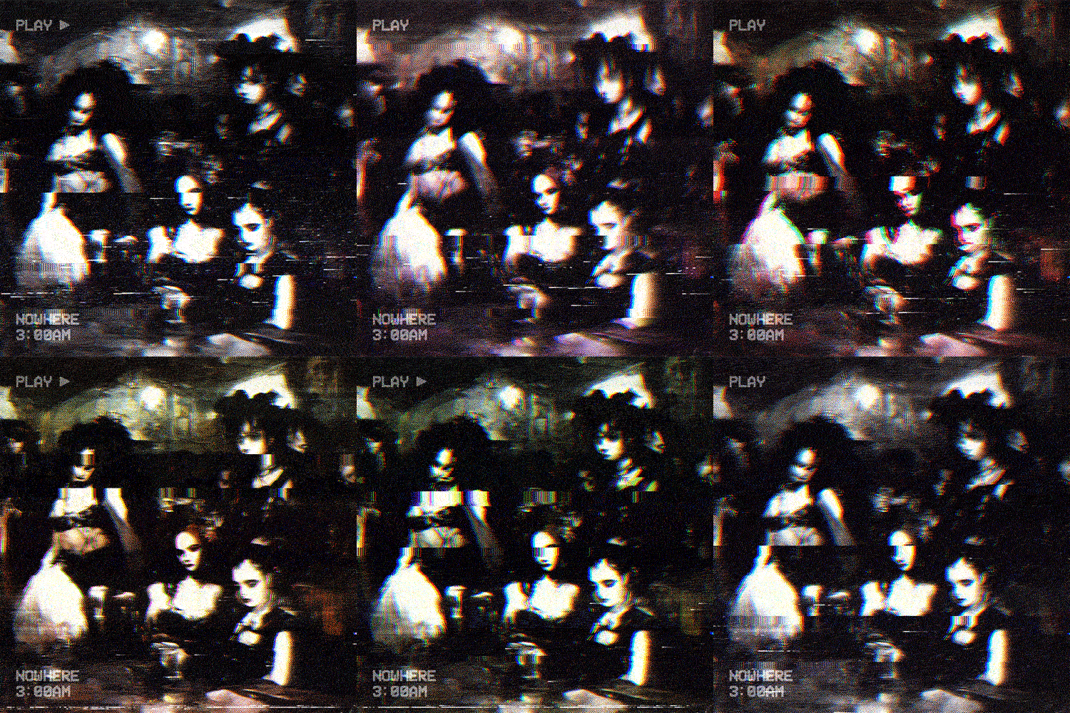
 3:00am in a random Goth Club - Art made in MidJourney / Animation in Photo Mosh Pro
Of late I seem to be listening to a lot more goth music, I had a randomly organic encounter with British / German Dark Wave duo Lebanon Hanover. Their track Totally Alive has all the hallmarks of an 80’s spiralling synth backed by metronomic drum machines wrapped in a shiny black art band shell. Of course the track drips with Gothic melancholia and is rounded out by samples and tinted with a touch of noise rock.
That then led me on a bit of a gothically fuelled rabbit hole deep dive, landing squarely on Canadian Art Post-Punk band Traitrs. Their sound has a slightly more modern feel than Lebanon Hanover but shares DNA strains with The Cure, early New Order and a dash of Bloc Party all tied together with a synthwave sensibility. Their track Thin Flesh feels cinematic and would work perfectly in a Nicolas Winding Refn movie.
Enjoy the darkness.
Unexpected Favourite
I first heard Public Image Ltd. in my early teens, I have vivid memories listening to John Lydon’s signature vocals during cold Adelaide winter evenings, reading 2000AD by a gas fire.
Fast forward a few short years and I discovered the movie Hardware, the cult cyberpunk horror film became an instant favourite and featured the PiL track The Order of Death from the album This is What You Want… This Is What You Get. This is a dark song originally conceived for the score to the 1983 Italian thriller Copkiller (alternatively titled The Order of Death) starring Harvey Keitel and John Lydon in the lead roles. The alternative title lending its name to the track.
The song it self has been a part of film and television soundtracks multiple times, including the previously mentioned Hardware, The Blair Witch Project, episode eps2.7_init_5.fve of the series Mr.Robot, an episode of the Netflix adaptation of Gerard Way’s Umbrella Academy and even an episode of the 80’s classic television series Miami Vice. It’s a song that seems to drift in and out of my aural field with an almost other-worldly regularity, however this isn’t a huge surprise as it carries a subtly pervasive energy that allows it to burrow into your subconscious, lying in wait to emerge at any unexpected future
time.
Lydon’s mesmerising chanting lyrics drift above and below a mechanically precise drum beat and entwine with synth and guitar lines to create an almost ritualistic energy. It’s consumingly atmospheric and sticks in your head better than any pop jingle I could ever think of.
I was listening to the track again today on a generated Spotify playlist and felt compelled to write this post. Public Image Ltd. are definitely one of my all time favourite bands, but I have to admit that The Order of Death is unexpectedly in my top 20 songs of all time, if not an even shorter list and I’d never even realised.
The Trailer for 1983’s Copkiller (aka The Order of Death)
And for anybody interested, check out the trailer for Hardware
Late to the Apocalypse
So I was digging around the internet in search of as yet undiscovered acting gems by the one and only Henry Rollins because, why not?
The entertainment powerhouse and one of my personal heroes has delivered a vast array of memorable performances (Heat, Johnny Mnemonic and He Never Died all personal favourites) but the cross media live show Gutterdämmerung looked to have been something even more epic in scale. A black and white, silent film backed by a live band and boasting a stellar array of music talent such as Grace Jones, Iggy Pop, Lemmy Kilmister, Joshua Homme, Nina Hagen and of course the man
himself.
I can only hope a live recording surfaces in the near future.
Goodbye Horses, Hello Crosses
††† (Crosses) is a side project of Deftness frontman Chino Moreno.
Dark, ethereal and edgy, their brooding sound has caused the band to be labelled dark wave or witch house. In reality the music sits squarely in between genres, shades of post punk synths flow over driving rock guitar with a healthy dose of gothic occult vibes and blend with a healthy dose of Deftness influence to create a genuinely fresh but strangely familiar sound.
Their most recent release, a cover of the Q Lazzarus track ‘Goodbye Horses’ is a pretty standard reproduction of the early 90’s hit albeit with that distinct Crosses edge.
Qotsa Mini-Documentary and the B0neface Connection
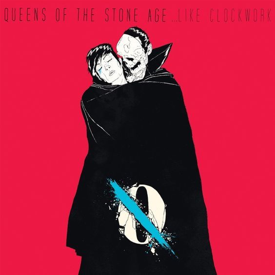
 …Like Clockwork
I’m a pretty big Queens of the Stone Age enthusiast, they’ve provided the soundtrack to various stages of my life and a couple genuinely amazing live music experiences. I really connected with the album ‘…Like Clockwork’ on a variety of levels, it gave me some great sounds while fighting my way through a period of radical personal growth, washed my rattled mind in a little sonic softness durning a mild heartbreak and introduced me to the work of UK artist Boneface.
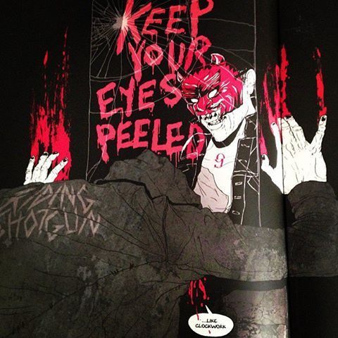
 Keep Your Eyes Peeled by B0neface
The artist teamed up with the band to create animated videos for five tracks, I Appear Missing, Kalopsia, Keep Your Eyes Peeled, If I Had A Tail and My God is the Sun. The culminative effort results in a story of ongoing struggle and injury depicted with stylish, ornately dark artwork and is a definite treat for the eyes. There’s something inherently DIY about the animation execution that makes them feel even a little more edgy in concert with the music.
The B0neface videos from …Like Clockwork
I also found a mini documentary on the making of the album by YouTube channel Middle8, It’s really well produced and if you’re even remotely interested in the band you’ll enjoy it. After watching the mini-doco I definitely have a greater appreciation for the album and feel a slightly stronger connection to the music than I did before.
And just because it’s equally as good and QotSA related, here’s another Middle8 video on the album ‘Songs for the Deaf’.
Currently Listening
††† (Crosses) is a side project created by Chino Morenno of the Deftones. Their music is a lot more melodic and electronically based, it’s quite haunting and has been filling my headphones regularly of late.
Got to love the 90’s glitch visuals coming back into fashion, ironically a lot of these kind of effects were created using CRT and real glitching back in the day, now it’s all digitally simulated.
Friday Afternoon Vibes and a Mind in Motion
Long White Cloud by Shapeshifter
Video by motion designer Umeric, this work is over a decade old but still brings me a little visual joy and gets me thinking about a possible fun side project or two.
Who also made this really dynamic Mtv promos, I always find inspiration when abstract 3D effects are fused with real footage.
New Share Image
So it’s been a while between drinks, a new baby boy will do that but don’t give up on me just yet! 
Current Mood Courtesy of Skold and Kmfdm
It’s Been a While, so Here’s a Head-Cleaner Straight Out of 1984
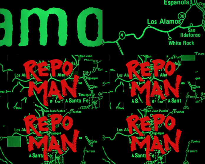
 Repo Man 1984
And if you’re not familiar with the Alex Cox film of the same name, here’s the trailer.
One of the only films that can be considered genuinely ‘punk’, instead of using the punk scene as a backdrop or window dressing, the movie is a reflection of the SoCal Punk Scene of the early 80’s and the issues that it rallied against. Although it was studio financed film, the film conveys a deep sense of the DIY aesthetic and its fuelled by off-beat humour, biting politically charged social satire and solid characters with developed arcs. And if that’s not enough to get you watching, it’s also a sci-fi, conspiracy thriller with car chases too.
 Radioactive Cars
 Disintergrations
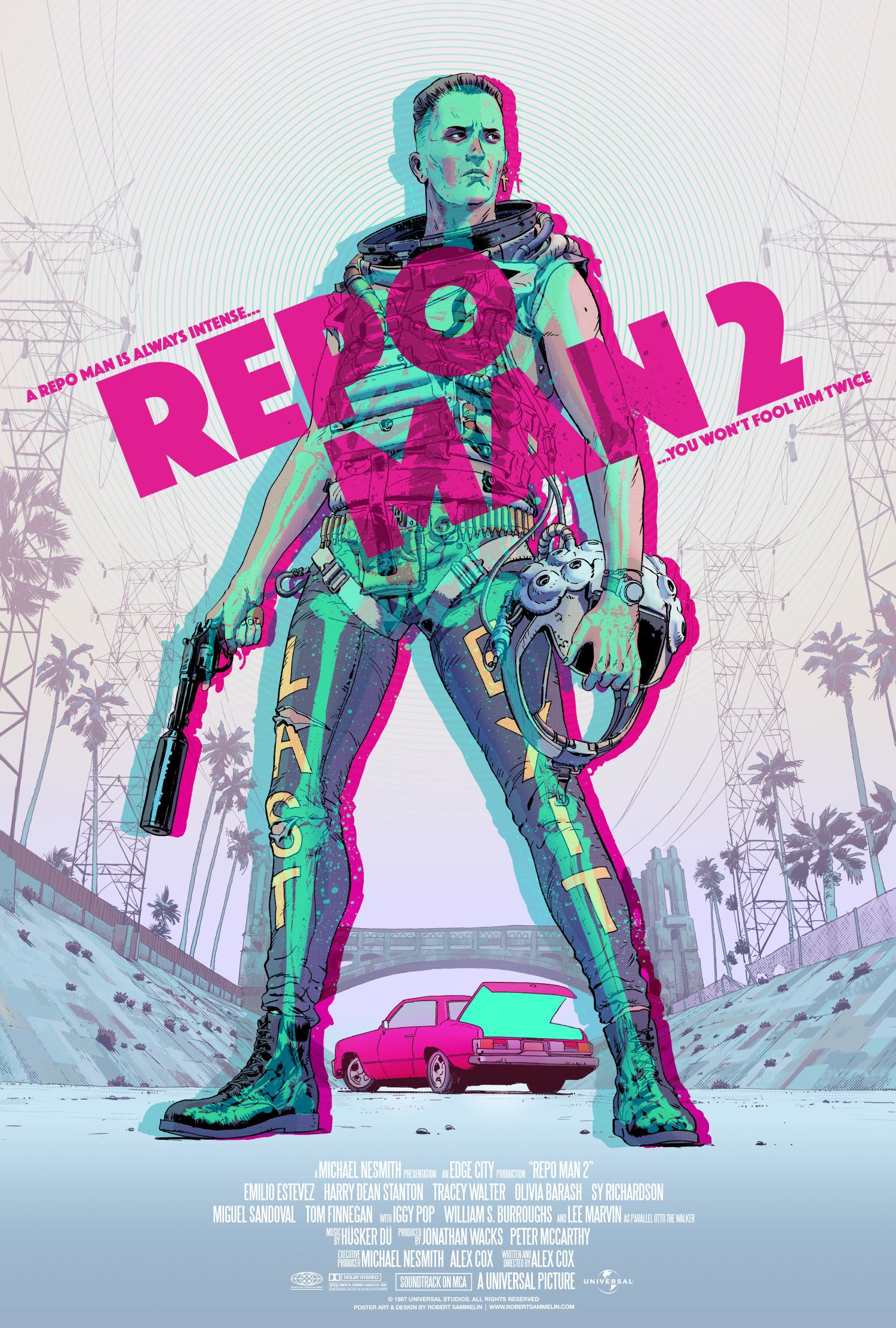
This movie has spawned some original art too. Check out this amazing poster design for an imagined sequel by artist Robert Sammelin.
 Repo Man 2
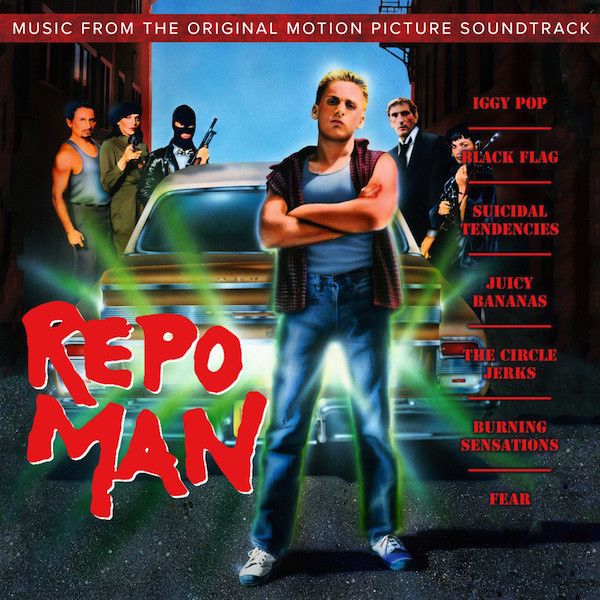
Finally, the soundtrack to the movie is the stuff of Punk Rock legend. Responsible for saving the feature from winding up a forgotten failure and transforming it into a cult movie classic. After the soundtrack sold so well, the then dead and buried movie (pulled after only a week of screenings due to a management change at Universal Studios), was re-released in theatres to claim a modest profit.
 Original Soundtrack
Aside from the epic theme provided by Iggy Pop, who the godfather of punk himself credits with turning his life around and bringing him back from the brink of destruction, the soundtrack boasts a variety of southern Californian hardcore punk acts, including Suicidal Tendencies, Circle Jerks and Fear to name a few and the film was scored by latino punk band The Plugz.
The always entertaining genius, that is Amanda Palmer covered the Suicidal Tendencies track Institutionalised used on the soundtrack. Showing the film is till inspiring artists out there.
I highly recommend this film, it’ll bring the punk rocker right out of you in a heartbeat.
Checking Off My ‘Cool List’
I finally got to watch the music documentary Rise of the Synths, something I’d been wanting to see for several years.
It’s definitely got great production value and if you’re not up to your neck in the genre, you’ll get some interesting insights. John Carpenter narrates the feature length exploration of a music scene dedicated to an idea of a decade that didn’t really exist, and gives it a little more gravitas for his input. The interviews are bridged by scenes featuring the mysterious Synthrider character, time travelling to pivotal time periods in his DMC DeLorean which adds much needed flair to what would otherwise be an hour and a half of talking heads.
I have a lot of love for this particular music style, it brings back memories of movies, pop-culture and video games that were a big part of my formative years. Overall the documentary is an enjoyable presentation but from my perspective it’s celebrating something I’m already very well acquainted with, but for someone just discovering the neon lit world of Synthwave, it’s a perfect introduction to get you excited.
An additional highlight is the killer original soundtrack provided by OGRE, definitely worth a listen and a great synth-laden ambient background for a work day.
From something 80’s flavoured to a distinctly 90’s product, I also grabbed the documentary Millennium after the Millennium. I was a big fan of the show when it aired and often recommended it to friends as,
‘The closest you’ll ever get to the movie SE7EN on network television.’
Of course this was in the pre-streaming, pre-blockbuster television era so X-Files and Millennium were as good as it got.
Dark, sometimes nihilistic and richly shot, the documentary comes to celebrate the Chris Carter creation and has interviews with Lance Henriksen. It’s long and primarily consists of talking head style interviews, so it’s not a quick dip in watch, but worth it even if you only have a passing interest in the show.
Finally I stumbled across another film making documentary that was a pleasant surprise, Life After Flash, produced in 2017, details the production of the 1980 sci-fi classic along with the ongoing life of lead actor, Sam Jones. It’s an quality breakdown, rich with interesting anecdotes and interviews that don’t just scrape the surface. Brian Blessed is a total highlight and worth watching the documentary for on his merits alone.
Old Punk Artistry
You might not know Winston Smith by name (not to be confused with the fictional protagonist from Orwell’s dystopian novel 1984), but there’s a good chance you’ve seen his work.
The San Francisco based collage artist has been creating dynamic, absurd and confronting imagery since the late 70’s. Countless images for flyers, album and single covers along with his most recognisable work, the logo for the legendary band the Dead Kennedys.
 The iconic logo for the Dead Kennedys - seen on pretty much everything during the early to mid 1980’s and is still recognisable to this day.
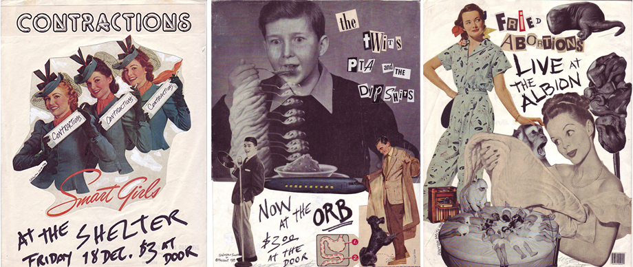
When the punk scene exploded like a pipe bomb in the US, Smith began creating flyers for bands that didn’t exist. Plastering them around San Francisco and swiftly promoting himself as an artist. In his own words from a Vice interview about the fictitious band flyers,
Since San Francisco is such a physically small city—it’s really a walking town—posters were the way people communicated about new shows or events. Most of the flyers back then were unintelligible, advertising events, but a small amount were for nothing having to do with anything. They were just made to be. Their only reason for existing was to see if you were paying attention. I found that to be a great inspiration. Since I was a talentless hack with no musical skills or connections in the punk scene, I saw this as an opportunity to dive into a world where an obscuro-nobody like myself could have a voice. At last, a chance to be a real nobody, with nothing to say!
 A small selection of fake punk bands
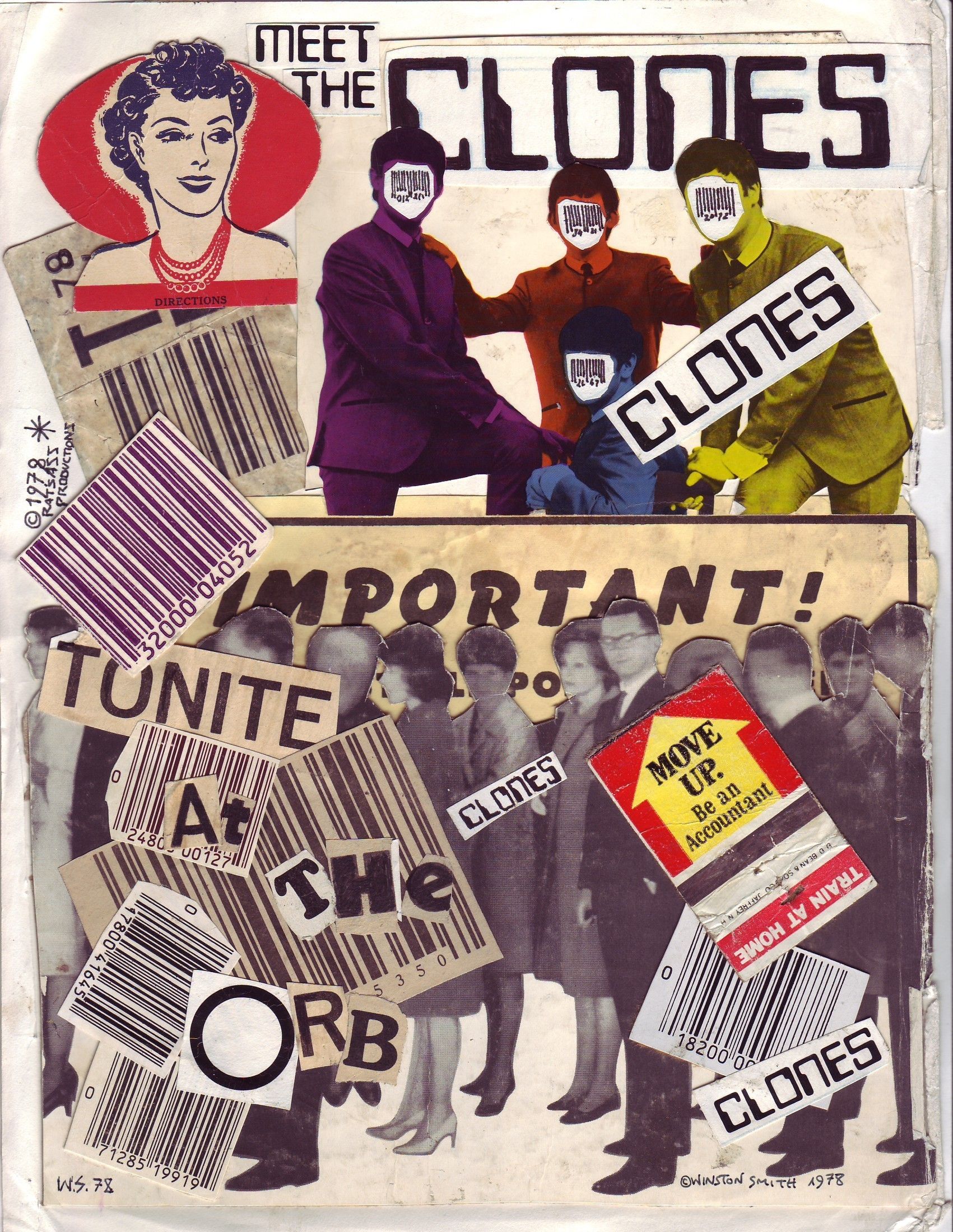
  Although rough around the edges, this poster for The Clones is a great example of Smith’s composition skills and visual sensibilities
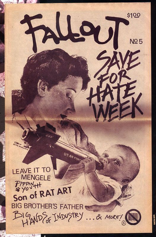
This led to the creation of a self-published punk zine Fallout part satire, part art portfolio, it thrust the artists work into the punk community and got him flyer work for real bands.
 Fallout
Then Smith met Jello Biafra and a perfect storm of creative chaos ensued, aside from the iconic band logo, he collaborated with the Dead Kennedys frontman to create the artwork for multiple releases, including the infamous In God We Trust release, that was banned in the UK. At this point you can see the refinement of Smith’s style, images pack more punch and depth.
 A small selection of work produced for the Dead Kennedys
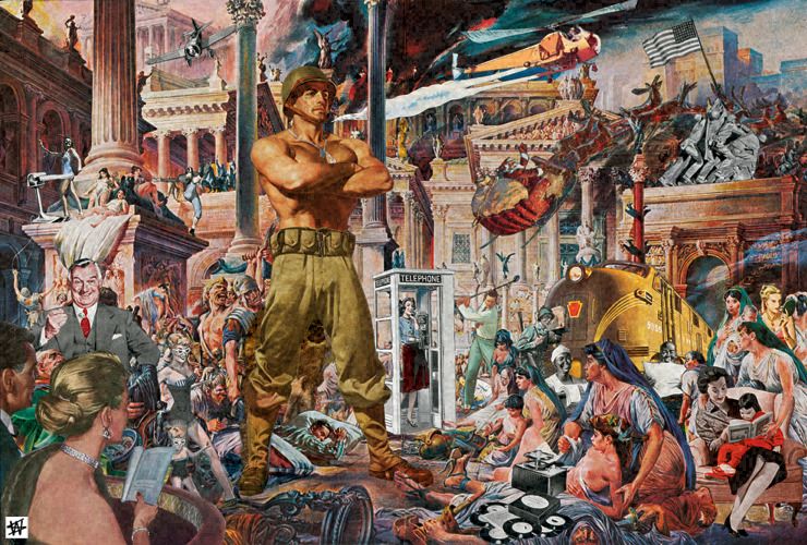
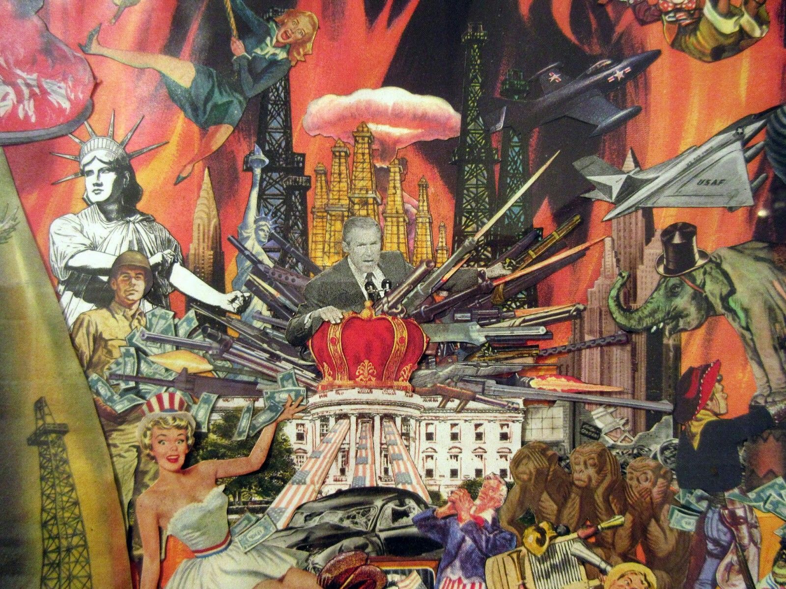
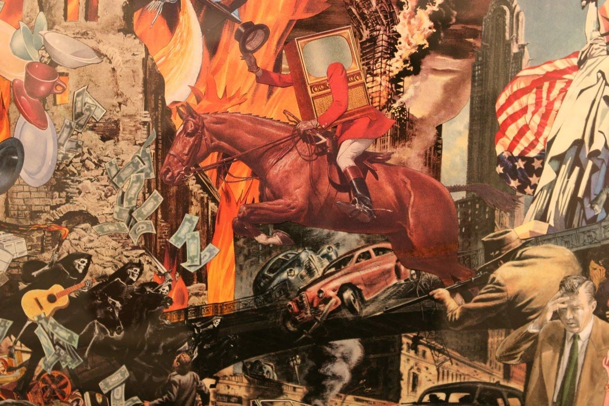
Unlike many artists attached to the music industry, Smith created images for himself, usually out of a sense of curiosity, this lead to some expansive art pieces. Still packed with absurdist observation, contrasting subject matter and wit as sharp as the scalpel he used to cut up the original component images.
 Pax Americana
  Armed Madhouse
  Untitled
The work is dense, with depth and movement. Underlying messages are easy to discern and cuttingly clever. What’s more impressive is to remember these pieces are completely analogue, one man, a ton of images and a scalpel are combined to unleash these Punk Art Surrealist pieces. Although created from others work, the new assemblies create uniform and cohesive artwork.
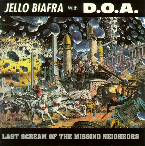
Jello Biafra has employed Smith on subsequent post Kennedys projects, such as his epic collaboration with Canadian hardcore outfit D.O.A., the resulting EP, Last Scream of the Missing Neighbors used Smith’s Demolition Derby piece for the cover.
 Last Scream of the Missing Neighbors
A side note, if you’ve never listened to this EP, check it out. It’s conscious social commentary wrapped in a blistering punk rock coating. The highlight is the 14 minute opus, Full Metal Jackoff. This song needs to be a movie.
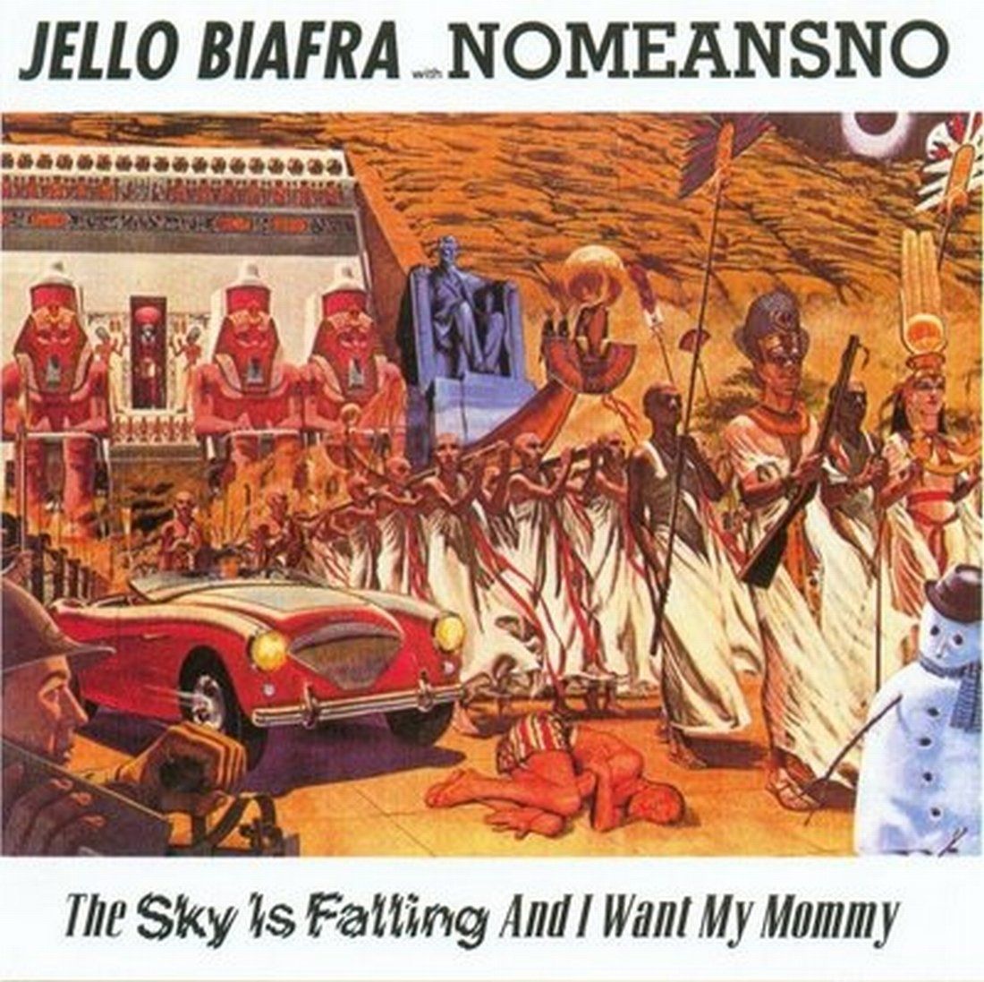
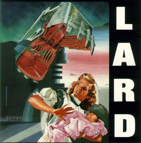
Again with Jello he provided art for his collaboration with NoMeansNo and the powerhouse Lard, his project with Al Jourgensen of Ministry fame.
 The Sky Is Falling and I Want My Mommy - Jello Biafra with Nomeansno
  The Last Temptation of Reid - Lard
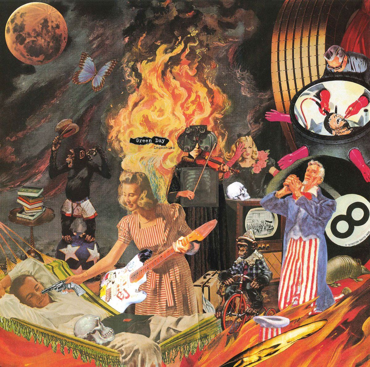
 Greenday’s Insomnia Release artwork
Still producing art, Smith continues to sear the viewing publics eyes with his special brand of visual anarchy. It’s worth a dive into if you’re looking for some inspiration.
He can be found at his website winstonsmith.com.
 Mona Mohawk
Take a Strange Moment
Let’s just take a brief moment to enjoy the beautiful strangeness, that is the work of animator Peter Chung.
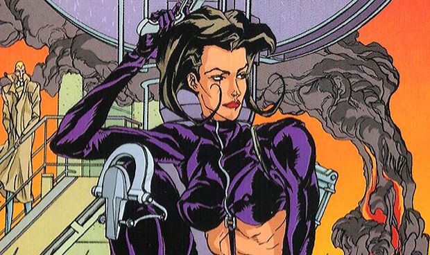
 The Iconic Æon Flux title image
I discovered the work of Peter Chung in the early 90’s, with a serialised short animation, as part of the experimental anthology series Liquid Television. Each original chapter an exercise in surreal action/sci-fi that teased out a story that was compelling, exciting and a little weird.
A leather clad spy makes her way through an oppressive, vaguely eastern bloc complex to take out a stereotypical looking dictator. On her way to his lair at the top of a tower, she leaves mountains of bodies in her a wake. Escaping extreme situation after next, courtesy of a machine-gun and her preternatural athleticism.
 The mysterious spy
With each segment the viewer is given a glimpse of a rapidly changing narrative, extreme violence is shown opposite sexualised, lightly kink flavoured scenarios. The faceless storm troopers, gunned down at the opening are unexpectedly humanised and the story concludes with the main character falling to her death by way of a stray nail in her boot heel. Her body and home remotely detonated and destroyed by a distant operator. The evil dictator is revealed to be dead and an additional character we’ve had teased throughout the segments, a rakish blonde man, cures an insect spread plague (but not before getting intimate with his assistant and a nurse).
The story doesn’t just end there, the blonde man becomes the leader of his nation and the spy is revealed to have gone to heaven, where a blue man indulges her foot fetish needs.
Yeah, you read that right.
This was Æon Flux and I was hooked.
World building and innovative story telling at its finest, the series told an expansive story through the agent’s journey, setting up two opposing sides, a dictator and a killer virus, kinky character back stories and all without one word of dialogue. It’s an impressive feat and more memorable for the stylistic approach that became a hallmark of Chung’s work.
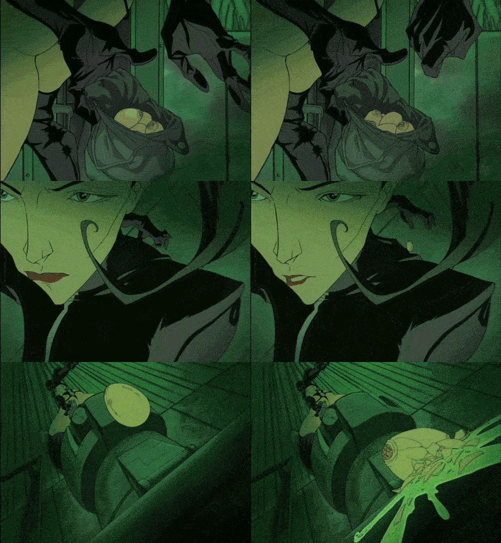
 An example of the over the top violence of War
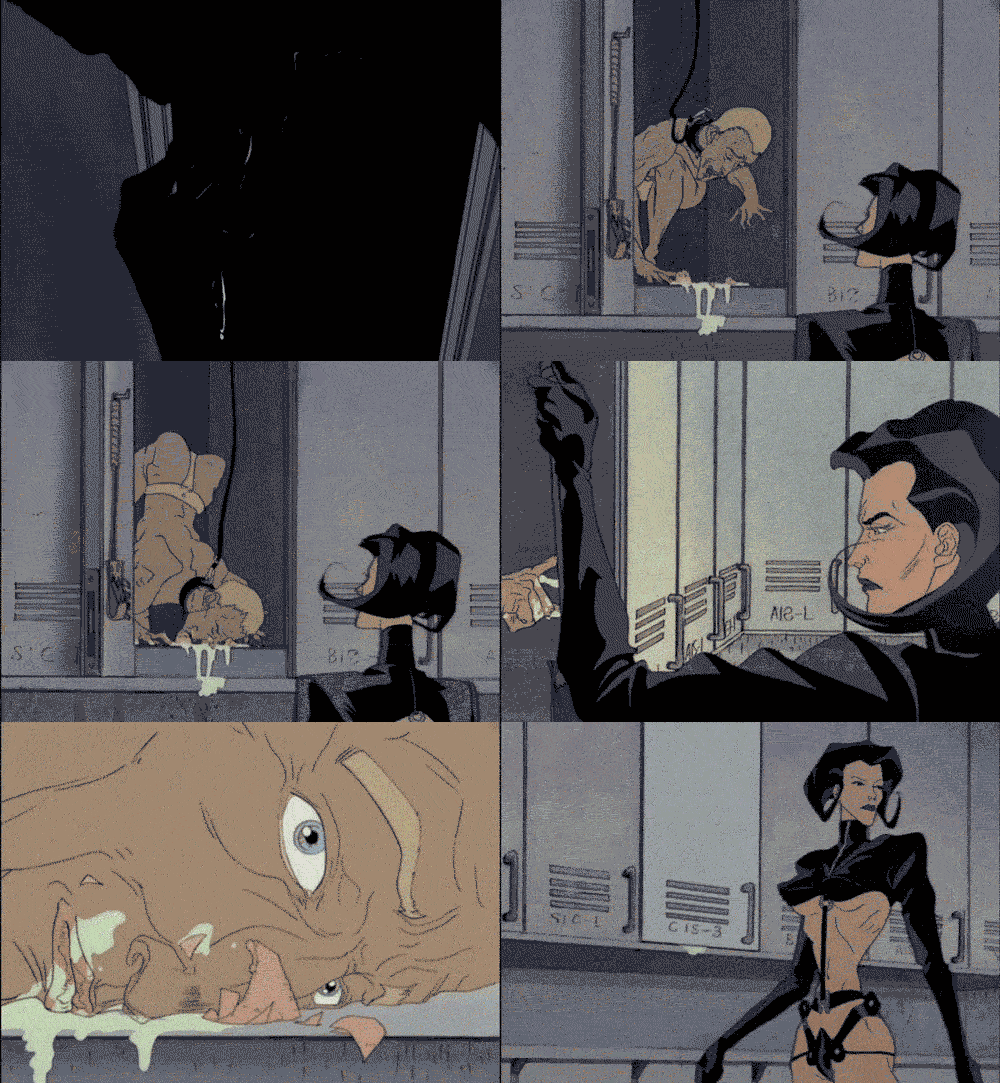
To keep things interesting the following 5 episodes of the fetishised character consisted of more surrealistic adventures. Each one ending with her death by different means. Such as gunshot, hanging, being eaten by an alien and head injury.This became something of a trademark of the show.
 Getting weird in the episode Leisure
 The as yet unnamed blonde man in a compromising situation
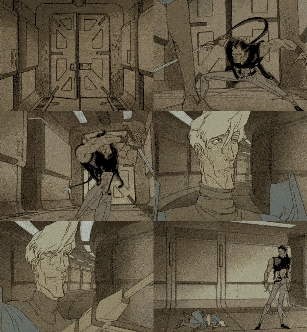
The set ups changed but the uniquely coifed, leather clad agent and the rakish blonde man were a constant, but their rivalry subtly changing. With the final episode in what was dubbed season 2 titled ** War ** the main character was dispatched in under a minute and a sprawling battle unfolded, focusing on a series of new characters that ultimately died as the story progresed. Imagery of stylised soldiers engaging in bloody battle was a constant and sandwiched in-between were the mild doses of kink. Creating something strange yet wonderful.
 The swordsman from War
The shorts always left me wanting more, so I was overjoyed to find the follow up 10 episode series, now with dialogue and 22 minute episodes. It was just as weird as the shorts but a little less risqué. Our secret agent was confirmed as the titular character and her ongoing adversary, the rakish blonde man was dubbed Trevor Goodchild. They were from opposing countries, one side a totalitarian state the other an anarchistic force.
 Trevor Goodchild
Each episode stood alone but featured the love/hate relationship between Æon and Trevor, with supporting casts of agents, aliens, monsters, a demigod and assorted weirdos. From a story telling perspective, what made the show special was the moral ambiguity of the characters. There were no good or bad sides, they just inhabited a world where launching the head of a blue god into space by rocket was normal. It was genuinely fresh.
 The head of the Demiurge
The art style was a combination of crisp industrial backdrops butted against organic abstract spaces, while long languid characters interacted before them. It was often surreal, sinister and a little dark.
 Entrance to a secret room in the episode Utopia or Deuteranopia
Overall, I’d recommend it to somebody wanting something completely different, and it’s a must for any animator as a source of inspiration, setting high bar for independent quality in animated storytelling.
There was a live action movie and a couple failed console games but they weren’t particularly good
At the same time as the series was being produced, Chung also created an MTV promo and a Pepsi commercial that featured Malcolm McDowell and Cindy Crawford.
Chung followed with an anime series titled Arekusandā Senki or Reign: The Conqueror, a Korean / Japanese co-production that retold the historical epic of Alexander the Great in a fantasy/sci-fi setting (it’s not remotely historically accurate, but it’s pretty fun), complete with a man eating horse, flying ninja assassins who happen to be working for a cult based around the philosopher and mathematician Pythagoras and a snake witch.
 The cast of heroes
 Alexander’s mother, Olympias the snake witch
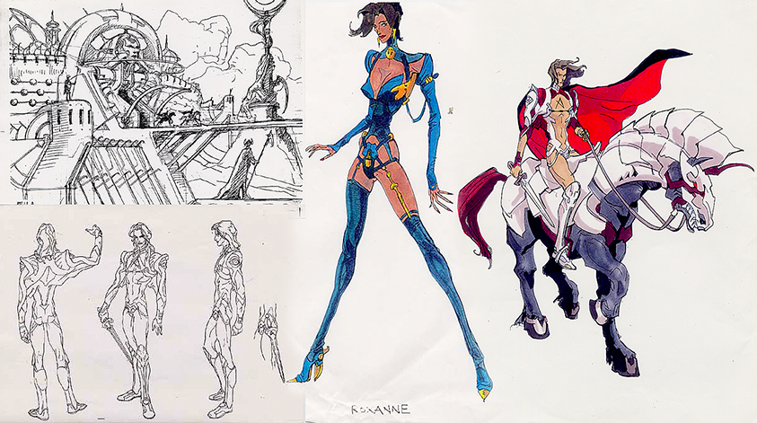
While not as artful as his previous production, it is fun and features some amazing battle scenes. The trademark sinuous characters and artfully surreal backgrounds abound, this time with a lurid colour palette. As it’s a mid to low budget anime title it can be a little slow but it’s still fun and a great reference for unique character designs, surrealist backgrounds and vibrant colour usage.
 Character art of Alexander
Chung directed a short piece for the Diablo III game release. Entitled Wrath, angels battle demons in this great example of his signature visual style.
 A still from the animation
Diablo III:Wrath
Watch on YouTube Here - it’s age restricted so it can’t be embedded here
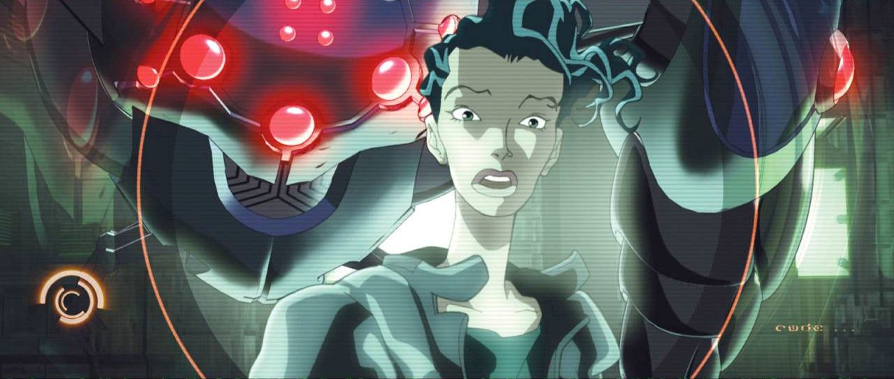
His last major release titled Matriculated, one of the segments in the Animatrix anthology feature. Combining both 3D and 2D animation, the languid free human characters were pitted against some very unique Sentinel designs of the machine world from the Matrix.

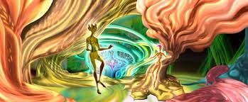
 Contrasted against the scenes set in the ‘real world’ the simulated world of Matriculated is a lurid acid trip
 The heroine of Matriculated
 A captured sentinel
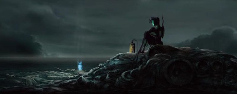
 Interestingly enough, the story spends more time on the surface than most of the movies do.
Equally surreal and dark as his previous work, it’s a great short piece that taps into the philosophy of the Warchowski’s Matrix world and delivers a suspenseful and action packed story.
Peter Chung’s segment from the Animatrix behind the scenes featurette.
Chung now teaches a master class in animation at the Division of Animation and Digital Arts at the USC School of Cinematic Arts. While it’s unfortunate that we’re not seeing any new animated series being created by him, his body of work is beyond impressive and still provides entertainment and inspiration nearly 30 years after a leather clad spy crept across our television screens in 1991.
Touring Imagined Worlds
So I’ve been playing with Artbreeder again, this time I wound up creating some pretty cool landscapes. I’m planning on creating some new artwork using these as the comps to start from.
 The Capitol
  The Ocean Port
  Rural Refinery
Visit the crypt for more.


 I’ve always had a strange fascination with